Wednesday, December 10, 2014

MODULE 1 - CHAPTER 12

STUDY THREE ARTISTS

HERTA PULS (1915-)

In her book “Kuna Indians of Panama”, Herta Puls talks about symbols and their use in the cutwork and appliqué designs of the Kuna Indian Molas.   Both religious symbols, and everyday objects in their environment were used in story telling Molas.   She believes that “all works of art relate in some way to the order which exists in nature”.

When hunting and gathering changed to farming, symbols likely started to relate to success in growing crops, like changing season, rain, and sun. The symbol of the cross developed as an equal limbed symbol depicting east north south and west. Supernatural powers or gods were believed connected with the points and they believed that a power emanated from the fixed point. Other Kuna symbols included the zigzag, depicting an umbilical cord, triangles denoting male or female depending on their orientation. The Kuna Indians also use a y-shaped symbol in their molas the only reason Herta Puls could find was that it was the shape of a stick used to lift their clothes up to high wooden beams in their huts.

In this same book, Herta also talks about how embroidery in the past was used not merely as decoration, but denoted status within a community, visual communication of stories or as symbols of spirituality. She wonders that today perhaps too much importance is given to techniques rather than to freedom of designs expressing individual values or beliefs.


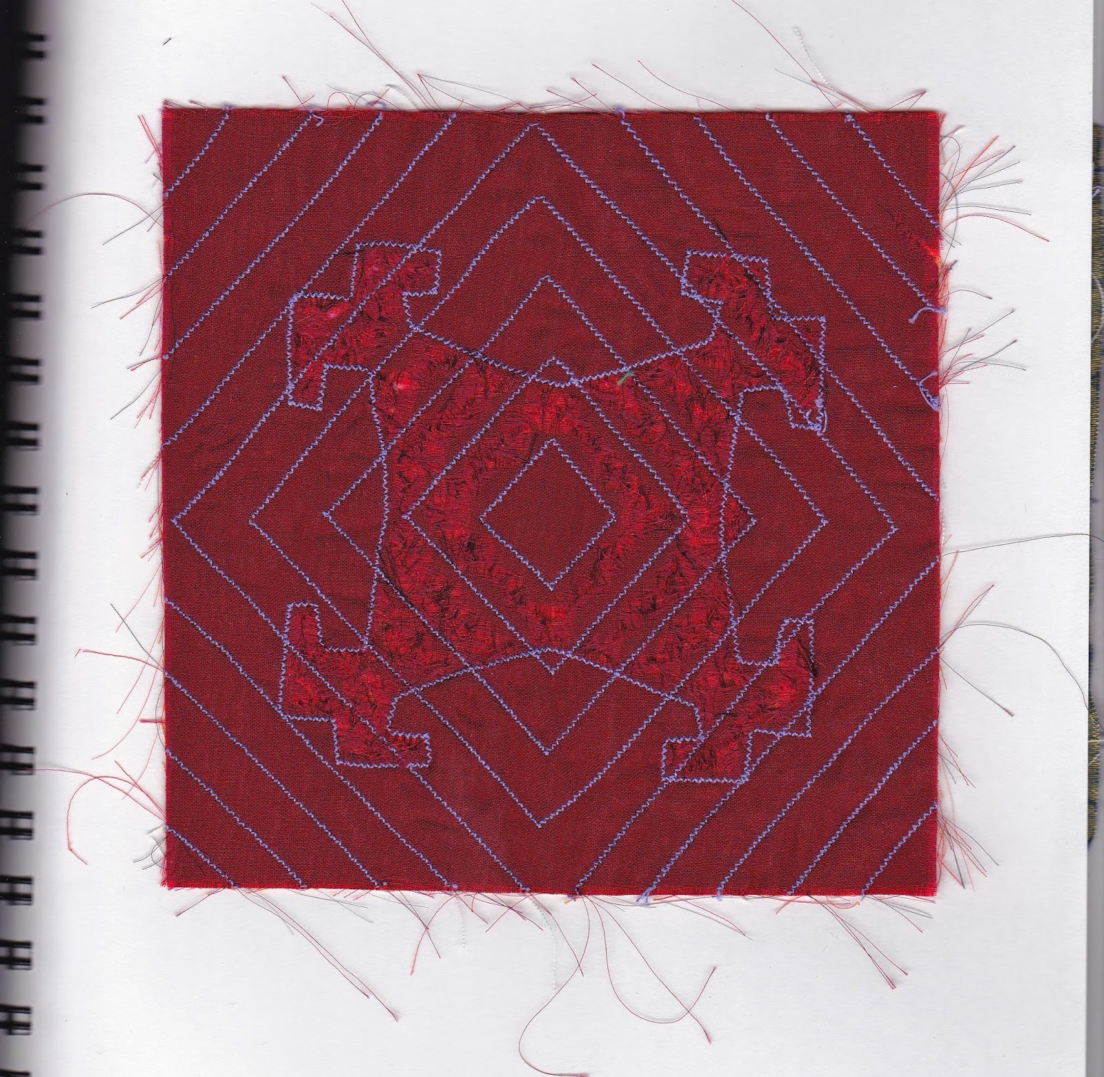
Mola work taken from Textiles of the Kuna Indians of Panama

The following two pictures are of of Herta Puls' own work.


References:
Puls, Herta.  Textiles of the Kuna Indians of Panama. Princes Risborough: Shire, 1988. Print.


WASSILY (VASILY) KANDINSKI (1866-1944)


 Kandinsky was a Russian artist who was a leading member of the Blaue Reiter . In his early work he depicted landscapes but gradually moved towards abstraction.  In his book, “Concerning the Spirituality in Art” he separated his work into three groups, Impressions which were the natural world, Improvisations depicted a mood or feeling, and Compositions were also inner visions but more like a symphony.  After leaving Russia, Kandinsky went to Berlin, then took up a position at the Bauhaus.  He then moved to Paris where he lived until his death in 1944.

I was lucky enough to see “Kandinsky. The path to Abstraction”  in 2006 at the Tate Modern.  One thing that struck me was how dark his early paintings were and how more and more light his paintings became the more abstract they were. His later paintings had much more emphasis on geometrical shapes, particularly circles and triangles.  He likened colours to sounds in an orchestra.

In Kandinsky’s book  he “ exhorts artists to not be idle but have a hard work to perform".  "Every deed, feeling and thought are raw material from which his work is to arise."  "Artists have great power, but great duties".  "The artist must have something to say, for mastery over form is not his goal but rather the adapting of form to its inner meaning”.


On White II 1923, Oil on Canvas
Musee National Art Moderne, Centre Georges Pompidou, Paris


Composition VIII, 1923, Oil on Canvas,
The Solomon R. Guggenheim Museum, N.Y.


White Cross, 1922, Oil on Canvas,
Collezione Peggy Guggenheim, Venice, Italy

References:
Paul, Kate. Kandinsky: The Path to Abstraction. London: Tate Modern, 2006. Print.
Janson, H.W., Anthony Janson F., and H. Janson W. History of Art: The Western Tradition. Upper Saddle River, NJ: Pearson/Prentice-Hall, 2004. Print.
Vergo, Peter. The Music of Painting: Music, Modernism and the Visual Arts from the Romantics to John Cage. Berlin: Phaidon, 2012. Print.
Kandinsky, Wassily. Concerning the Spiritual in Art. New York: Dover Publications, 1977. Print


JUDY MARTIN

I was first introduced to Judy’s work when I attended the 2012 Middlesex BFA graduation exhibition in England.  A couple of  friends were also in the same graduating class.  I really connected to Judy’s work and have subsequently been an avid reader of her blog and follower of her work.

Much of her earlier work was primarily quilting, but more and more she is using hand stitching in her often very large pieces.  Sometimes her work is completely covered in dense hand stitching, on hand dyed fabric. The fabric she uses is often repurposed and hand dyed damask tablecloths or woolen blankets.

 Her mornings are frequently spent at home, hand stitching, which she likens to meditation . Her afternoons are spent in her studio. Inspiration for her work comes from her nearly 200 journals filled with bits of poetry, snippets of conversation, sketches, artist studies and other bits of ephemera,  Judy lives on Manatoulin Island in Ontario, Canada and her work often is influenced by the environment where she lives.  While her work is contemporary, she also includes traditional values of family and home. I find her work truly inspirational. I would like to thank Judy for giving me permission to use her photographs here.

You can find more information about Judy in her interview for The World of Threads exhibition and her Blog, both are referenced below.

                                       
Cross my Heart


Blue Willow Cloth made for her daughter's wedding based on the pattern on blue willow dishes.


's

Reverse Applique Dots

References:
judys-journal.blogspot.ca

On researching these three artists, I notice that besides their unique ways of using crosses, other symbols,applique, or reverse applique,  They all have a common theme of looking beyond techniques and skill, to portrayal of inner deeply important feelings of spirituality, values and meaning in their work.


Monday, September 8, 2014

MODULE 1 - CHAPTER 12

DIFFERENT WAYS OF USING THE SHAPES TO SHOW DISINTEGRATION.

1. Sample one shows one of the previous samples in three different sizes. I like the stitched background which looks like the shape is fading away.  The main shape itself is lightly padded and with its strong colour looks like it has some growth. I thought this had some potential, but was a bit fussy to make in an 8X8 inch size.  It would look better as a larger wall hanging.


2. Sample two is a series of stacked crosses that have been squished to show some disintegration.  The stitching which is the same colour as the background also shows disintegration.  I think it is a bit too regular and predictable, so ruled out this sample.


3. Sample three has differences in size and shape with some disappearing machine embroidered shapes behind, together with smaller scale cross shapes.  There is a different shape cross that is stronger to show growth, but with only one, it seemed perhaps too strong.  I liked the crosses in the two corners that were more sheer and lacy.  I thought this design had a lot more interest.


4. Sample four had the differences of scale and while the largest shape is strong, it also looks part of the whole and not out of place.  I liked the symmetry of the lacy four corners.  The elements seemed to work together on several different levels, which gave more interest than the other samples.  It was also in a scale that worked with the 8x8 inch format.

5. This is the resolved sample based on sample 4.  The corner pieces were made out of polyester organza with wonder under backing to give it some stiffness as well as a method of application to the background.  The larger cross, though made from the same fabric, is a slightly stronger red.  I also used some padding stuffing from behind in the trapunto manner, but not so much that it distorted the background too much.  I also used two rounds of machine stitching to make sure that the padding was well contained.  The machine stitched shapes in the background gives the illusion of disintegration as does the hand stitching with the same colour thread as the background fabric.  With the multiple methods of showing disintegration and/or growth, I think it makes this sample quite a bit more dynamic. However the lacy corners softens the effect somewhat and gives some contrast to the stronger colours and shapes.

Wednesday, August 6, 2014

MODULE 1 - CHAPTER 11 - PART 3

RESOLVED SAMPLE - GROWTH AND DISINTEGRATION
FOURTH THOUGHTS - STITCHED SHAPES


Trial samples using machine stitching in same colour thread as ground fabric to make each shape look thinner, smaller and less solid.
1a. 

1b.

1c.

1d.


Same exercise but using hand stitching, in this case I used seed stitching.

2a.

2b 
  I must confess that in this sample it is not all my own handiwork. I had taken the sample with me to stitch at our Calgary Folk Festival.  A wonderful time sitting on our blankets and chairs in the sun, listening to music and stitching.  This year our daughter and 4 year old grandaughter came with us and as soon as I bring out any knitting or stitching, my grandaughter immediately wants to "help".  She stitched several of these stitches and I was taken by how well she did using a hoop and really a quite small sharp needle.  The only extra safety precaution was to tie the thread to the needle as she hadn't mastered holding the thread at the same time as pulling the needle and I didn't want her to lose the needle.  She was very careful and only needed a little help with placement of the needle.  I think we may have a developing needlewoman in our midst! Children always amaze me how they can use adult tools really well once they are taught how and shown the safe way to use them.  It was a joyful day!

2c

2d

I really liked the way the seed stitching worked and although it is more time consuming than machine stitching, I am always pleased with the result of hand stitching.  It is rhythmic, meditative and portable.

MODULE 1 - CHAPTER 11 - PART 2

RESOLVED SAMPLE - GROWTH AND DISINTEGRATION
THIRD THOUGHTS - FABRIC SHAPES

1a. Top and bottom - folded squares folded and cut

T
1b Top and bottom - negative shapes

1c. Top - fabric square cut with edges frayed. Bottom - fabric square folded cut and frayed

1d .Fabric square frayed with four small frayed triangles places in angles

1e. Fabric square snipped and frayed with small triangles added at corner

1f. Nine small fabric squares frayed to form cross shape

1g. Two frayed rectangles placed diagonally across each other

1h. Fabric square folded and cut. All negative shapes used

1i. Top -Threads and tiny fabric scraps placed between two layers of Contact paper before folding and cutting.  The Contact paper was not really sticky enough to seal everything in.  Perhaps I should have used less threads. Bottom - Threads and tiny fabric scraps placed between two layers of bondaweb before folding and cutting. This method was much more successful but tended to stick to each other when folded.

1j. Fabric snipped then the cut edges frayed


MODULE 1 - CHAPTER 11 - Part 1


RESOLVED SAMPLE - GROWTH AND DISINTEGRATION
FIRST THOUGHTS - PAPER INSPIRATION


1a. Samples of  paper that have been crumpled, slashed with scissors, slashed with the scissors open and torn.


1b. Top sample has been slashed and exploded (could explode more another time), bottom sample has holes punched in it. I really like the lacy effect and this really shows some disintegration.

2a. Tissue paper -top sample was machine stitched with grid. Paper was wetted and scraped to edges. Bottom sample was stitched with circular shapes, wetted and parts removed.

2b. Top sample is regular computer paper, stitched in grid, wetted and some paper removed. Bottom sample is painted newsprint, stitched with circles, wetted and some paper removed. I think the thinner newsprint and tissue paper worked best but the tissue was quite delicate to handle.

SECOND THOUGHTS - PAPER SHAPES

3a increasingly disintegrating, though maybe not enough difference.

3b. Increasingly disintegrating.

3c. Negative shape with small circles 

3d. Negative shape using little snippets - I like sticking to black, more cohesive than adding colour.

3e. Negative shape using torn paper

Monday, June 23, 2014

MODULE 1, CHAPTER 10


MAKING RIPPLES
CHENILLE OR SLASHED REVERSE APPLIQUE

A few different drawings of possible designs


1a


1b

1c

2. Slashing outside the design

3. Slashing inside the design


OPTIONAL MELTING SECTION


Test 1a


Test 1b


Test 2a

I really thought from Test 1a that the thickness of the velvet would work well, but it actually did not turn out as well as expected.  It might have been better with fewer layers to counteract the thickness.


Test 2b

This was definitely easier to work with as I used thinner layers of organza or more lightweight fabrics.


TRANSLATING A DESIGN USING A SOLDERING IRON


3

I think this is quite effective.  The green layer was able to be burnt as well, but it was a little thicker than the other layers so could act as a blocker.  The colour of the bottom cotton fabric was bright enough to show up well.  The whole effect though was a little more like "plastic" than I would have liked and I think another time I would use less layers.