Monday, June 23, 2014

MODULE 1, CHAPTER 10


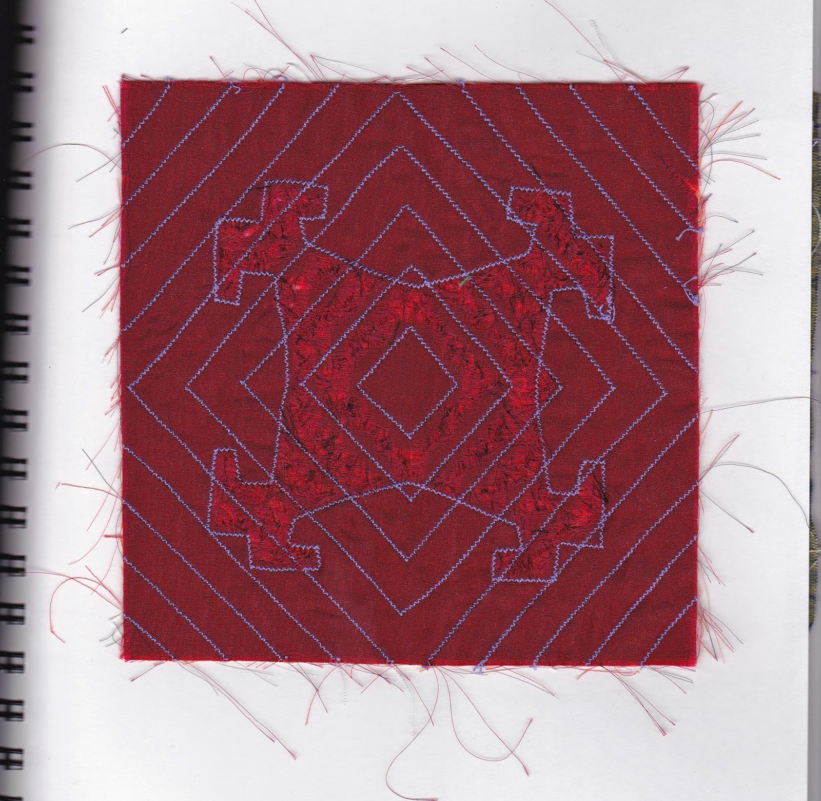
MAKING RIPPLES
CHENILLE OR SLASHED REVERSE APPLIQUE

A few different drawings of possible designs


1a


1b

1c

2. Slashing outside the design

3. Slashing inside the design


OPTIONAL MELTING SECTION


Test 1a


Test 1b


Test 2a

I really thought from Test 1a that the thickness of the velvet would work well, but it actually did not turn out as well as expected.  It might have been better with fewer layers to counteract the thickness.


Test 2b

This was definitely easier to work with as I used thinner layers of organza or more lightweight fabrics.


TRANSLATING A DESIGN USING A SOLDERING IRON


3

I think this is quite effective.  The green layer was able to be burnt as well, but it was a little thicker than the other layers so could act as a blocker.  The colour of the bottom cotton fabric was bright enough to show up well.  The whole effect though was a little more like "plastic" than I would have liked and I think another time I would use less layers.


Tuesday, June 10, 2014

MODULE 1 - CHAPTER 9

REVERSE APPLIQUE - TRADITIONAL AND CONTEMPORARY METHODS


TRADITIONAL METHOD:


1. I always enjoy hand stitching, although it is slow, there seems to be always so much more control

CONTEMPORARY METHODS USING MACHINE STITCHING


2. Cutting on inside of stitching - starting from outside in. This is a bit like map reading for me, I have to read the instructions multiple times to make sure I am getting it right


3. This one I started off on the wrong track - I got confused with cutting inside or outside stitching. I ended up doing an extra row.  I quite like the red cross in the middle, a happy accident.  Then  I got it right and cut outside the stitching, starting from the inside.  These accidents do show the way to other possibilities!

MULTI-COLOURED RIPPLE OR CONTOUR EFFECT


4. This is definitely a "learning" piece. I cut through too many layers, but it made me much more careful for the remaining cuts.  My mistaken slash could be used as a surface design tool in the right circumstances


5. I tried using more haphazzard layers of fabric and at different angles.  I can see using lots more small pieces of fabric would have various different effects depending how much you cut away


MODULE 1 - CHAPTER 8

COMPLEX SAMPLES

1. The machine embroidery I did in a hoop, but there is still a little buckling


2. I really like the simplicity of this and I think that doing the machine embroidery following the interior of the design is quite effective.

3. Next time I will do a double line of stitching, not cut so close to the stitching and use less stuffing material. I burst the seams with the over stuffing and had to do some repairing of the burst seams.  I like the general design though, using the same shape, once with stitching and then using trapunto for the other shape.


4. This time I used two similar but different shapes in machine embroidery and then bonded the top silk layer.   


5. I tried some more trapunto, this time I used much less stuffing and mostly used it in the main areas, the smaller areas were quite a bit more tricky to manouver.  There was some residual wonder under on the silk, so took some separating to make that work, resulting in cutting through the top layer.  So many things to think of.  The design on the bottom could have been slightly larger and the top design could have been better centred


6. This time I wanted to see how it would work with just layers of machine embroidery and whether it would be enough to show that there are different layers.  I think it worked quite well.  Either more or less dense machine embroidery would change the effect.


Tuesday, May 20, 2014

MODULE 1 - Chapter 7

TRANSLATING THE LAYERED DESIGNS INTO EMBROIDERY

I really enjoyed the process of layering the designs and I love hand stitching and the meditative aspect of hand stitching.  But by the time I had come to the sixth piece and basically the 11th layer of stitching and countless hours that entailed - I really enjoyed machine stitching the last four layers! I also enjoyed playing around with the same two colours of red and green, but using different shades and different qualities of translucency.  Lots of opportunities for play.


 I will rewrite the comments as they are a bit hard to read on the pictures)
1) Simple running stitch.  Organza frayed easily.  I tried to use that to advantage and frayed back to stitching


2) The first layer was silk and frayed quite easily.  I used double row of stitching on the top layer


3) I liked the simplicity of this sample.  Using the opposite colours for the stitching was quite effective


4) This time I used Wonder Under on the organza to stop the fraying


5) I used more complex stitching.  The second layer was silk and next time I would use Wonder Under to make it more stable.  I think also I would limit the extra stitching to the top layer as I think the two layers compete too much.  The first layer with only one row of running stitch looks better and the focus would be the top layer, which was intended


6) Four layers.  The first layer used the negative shape. Second layer did not have Wonder Under and is much more translucent than third layer, which did.  I like that the stamping showed up a little better on third by doing that.  Using the sewing machine certainly sped things up!  I think the simple machine stitching worked well with so many layers.  If I had used colourful or heavier embroidery thread, I think the whole piece would have been overwhelmed, even if I had only embroidered the top layer.  I think the colours and fabrics were able to speak for themselves.

Tuesday, May 6, 2014

WHY I WAS IN MY BASEMENT PAINTING THIS WEEKEND

We had three days of heavy, wet snow, but this is fairly typical of May.  It is a good thing that the temperature hovers around the freezing mark, so the main roads are pretty driveable and today the roads and trees are bare.  It is a sign that winter is almost over and the spring flowers, though somewhat crushed, are grateful for the moisture


This is a  rope, holding up the suet feeder and an attempt to foil the squirrels - working so far, but the birds aren't too thrilled about it either.  The rope is normally 1/4" wide!

How can you be sad about the snow when you get such gifts as this icy lace?

MODULE 1 - CHAPTER 6

USE OF BONDING IN APPLIQUE

The top layer is stamped cotton, the second is stamped oganza, bonded to previously hand dyed cotton


B) The base is "made" fabric on a base of red commercial cotton, covered with Wonder Under, using scrap pieces of fabric, threads and tiny sequins I had bought in Doha, covered with net that I had ironed on the back with Wonder Under. The top layer is printed hand dyed silk.


 C) The backing is the same commercial red cotton, with a similarly "made" fabric, this time with green colour and the cross I had found on the headstone in Banff.

D) "made" green backing with unprinted organza bonded on top.  I found I needed a fairly strong contrast for the organzas to stand out.

E) Hand dyed cotton with cut out shape from "made" fabric bonded on top.  This is using only one bonded layer and it seems much calmer, but perhaps needs some stitching on top to marry the two together.


F) I really like the colours of this one.  The backing is crumpled hand painted tissue paper. The first layer is printed organza, using an  asymmetrical design, and the top layer is printed cotton.

G) Backing is plain commercial cotton, first layer is bonded crumpled ,hand painted , tissue paper, and top layer is hand dyed, printed silk.

H) Backing is commercial cotton, first layer is painted Wonder Under, top layer is bonded , painted and crumpled tissue paper

I) Backing is commercial cotton, second layer is bonded, painted and crumpled tissue paper and top layer is painted Wonder Under


J) Backing is printed hand dyed cotton, lst layer is using "made" fabric negative shapes and top layer is asymmetric commercial cotton.  I felt it was getting a bit busy to attempted to tone is down with the top layer

K) Background is hand dyed cotton, first layer is printed commercial cotton using negative shapes and top layer is asymmetric,  printed hand dyed cotton


L) Base layer is hand dyed cotton, first layer is printed, hand dyed cotton negative shapes and top is plain commercial unknown fibre asymmetric shape

M) Background is hand dyed silk chiffon, first layer is unprinted organza and top layer is painted Wonder Under.  I tried various combinations with the painted Wonder Under, but it didn't really show up well, even against pale colours.  Perhaps the paint needed to be stronger but I found the Wonder Under needed to be realatively wet in order to get the nice effect of rippling


Me at work painting the Wonder Under at my painting table in the basement.  It was an awful weekend with loads of wet snow, so it was a good time to be cozy and warm painting away in the basement!


MODULE 1 - CHAPTER 5

FABRIC SELECTION AND DECORATION


I used a mixture of cottons, organzas, silk and unknown manmade fibre.  When it came to doing the stamping, I used the same stamp throughout, but tried to vary the methods of use. I tried random stamping, leaving gaps between them, then leaving no gaps, turning the shape at different angles and printing adjacent but turning the stamp 90 degrees.  I also played around with the paint, using the same green and red acrylic as before, but this time adding green transference paint to the green to give it a bit of a sheen when looking at different angles and using a warm gold with the red.  I added fabric medium so that the hand of the fabric would remain softer than using just acrylic paint.  Also the fabric would remain colourfast after it had been ironed to set the colours.  I changed the pressure of stamping at times and at others printed two or three times without reloading the stamp.  It was interesting to see that this was much more successful on fabric, and the paint went a lot further.