Monday, September 8, 2014

MODULE 1 - CHAPTER 12

DIFFERENT WAYS OF USING THE SHAPES TO SHOW DISINTEGRATION.

1. Sample one shows one of the previous samples in three different sizes. I like the stitched background which looks like the shape is fading away.  The main shape itself is lightly padded and with its strong colour looks like it has some growth. I thought this had some potential, but was a bit fussy to make in an 8X8 inch size.  It would look better as a larger wall hanging.


2. Sample two is a series of stacked crosses that have been squished to show some disintegration.  The stitching which is the same colour as the background also shows disintegration.  I think it is a bit too regular and predictable, so ruled out this sample.


3. Sample three has differences in size and shape with some disappearing machine embroidered shapes behind, together with smaller scale cross shapes.  There is a different shape cross that is stronger to show growth, but with only one, it seemed perhaps too strong.  I liked the crosses in the two corners that were more sheer and lacy.  I thought this design had a lot more interest.


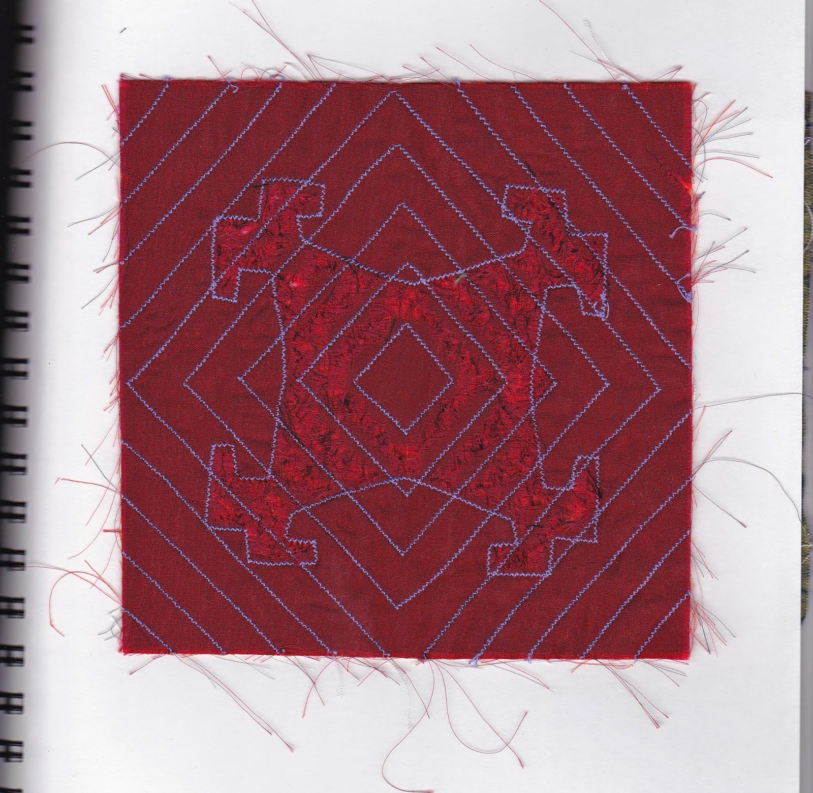
4. Sample four had the differences of scale and while the largest shape is strong, it also looks part of the whole and not out of place.  I liked the symmetry of the lacy four corners.  The elements seemed to work together on several different levels, which gave more interest than the other samples.  It was also in a scale that worked with the 8x8 inch format.

5. This is the resolved sample based on sample 4.  The corner pieces were made out of polyester organza with wonder under backing to give it some stiffness as well as a method of application to the background.  The larger cross, though made from the same fabric, is a slightly stronger red.  I also used some padding stuffing from behind in the trapunto manner, but not so much that it distorted the background too much.  I also used two rounds of machine stitching to make sure that the padding was well contained.  The machine stitched shapes in the background gives the illusion of disintegration as does the hand stitching with the same colour thread as the background fabric.  With the multiple methods of showing disintegration and/or growth, I think it makes this sample quite a bit more dynamic. However the lacy corners softens the effect somewhat and gives some contrast to the stronger colours and shapes.

Wednesday, August 6, 2014

MODULE 1 - CHAPTER 11 - PART 3

RESOLVED SAMPLE - GROWTH AND DISINTEGRATION
FOURTH THOUGHTS - STITCHED SHAPES


Trial samples using machine stitching in same colour thread as ground fabric to make each shape look thinner, smaller and less solid.
1a. 

1b.

1c.

1d.


Same exercise but using hand stitching, in this case I used seed stitching.

2a.

2b 
  I must confess that in this sample it is not all my own handiwork. I had taken the sample with me to stitch at our Calgary Folk Festival.  A wonderful time sitting on our blankets and chairs in the sun, listening to music and stitching.  This year our daughter and 4 year old grandaughter came with us and as soon as I bring out any knitting or stitching, my grandaughter immediately wants to "help".  She stitched several of these stitches and I was taken by how well she did using a hoop and really a quite small sharp needle.  The only extra safety precaution was to tie the thread to the needle as she hadn't mastered holding the thread at the same time as pulling the needle and I didn't want her to lose the needle.  She was very careful and only needed a little help with placement of the needle.  I think we may have a developing needlewoman in our midst! Children always amaze me how they can use adult tools really well once they are taught how and shown the safe way to use them.  It was a joyful day!

2c

2d

I really liked the way the seed stitching worked and although it is more time consuming than machine stitching, I am always pleased with the result of hand stitching.  It is rhythmic, meditative and portable.

MODULE 1 - CHAPTER 11 - PART 2

RESOLVED SAMPLE - GROWTH AND DISINTEGRATION
THIRD THOUGHTS - FABRIC SHAPES

1a. Top and bottom - folded squares folded and cut

T
1b Top and bottom - negative shapes

1c. Top - fabric square cut with edges frayed. Bottom - fabric square folded cut and frayed

1d .Fabric square frayed with four small frayed triangles places in angles

1e. Fabric square snipped and frayed with small triangles added at corner

1f. Nine small fabric squares frayed to form cross shape

1g. Two frayed rectangles placed diagonally across each other

1h. Fabric square folded and cut. All negative shapes used

1i. Top -Threads and tiny fabric scraps placed between two layers of Contact paper before folding and cutting.  The Contact paper was not really sticky enough to seal everything in.  Perhaps I should have used less threads. Bottom - Threads and tiny fabric scraps placed between two layers of bondaweb before folding and cutting. This method was much more successful but tended to stick to each other when folded.

1j. Fabric snipped then the cut edges frayed


MODULE 1 - CHAPTER 11 - Part 1


RESOLVED SAMPLE - GROWTH AND DISINTEGRATION
FIRST THOUGHTS - PAPER INSPIRATION


1a. Samples of  paper that have been crumpled, slashed with scissors, slashed with the scissors open and torn.


1b. Top sample has been slashed and exploded (could explode more another time), bottom sample has holes punched in it. I really like the lacy effect and this really shows some disintegration.

2a. Tissue paper -top sample was machine stitched with grid. Paper was wetted and scraped to edges. Bottom sample was stitched with circular shapes, wetted and parts removed.

2b. Top sample is regular computer paper, stitched in grid, wetted and some paper removed. Bottom sample is painted newsprint, stitched with circles, wetted and some paper removed. I think the thinner newsprint and tissue paper worked best but the tissue was quite delicate to handle.

SECOND THOUGHTS - PAPER SHAPES

3a increasingly disintegrating, though maybe not enough difference.

3b. Increasingly disintegrating.

3c. Negative shape with small circles 

3d. Negative shape using little snippets - I like sticking to black, more cohesive than adding colour.

3e. Negative shape using torn paper

Monday, June 23, 2014

MODULE 1, CHAPTER 10


MAKING RIPPLES
CHENILLE OR SLASHED REVERSE APPLIQUE

A few different drawings of possible designs


1a


1b

1c

2. Slashing outside the design

3. Slashing inside the design


OPTIONAL MELTING SECTION


Test 1a


Test 1b


Test 2a

I really thought from Test 1a that the thickness of the velvet would work well, but it actually did not turn out as well as expected.  It might have been better with fewer layers to counteract the thickness.


Test 2b

This was definitely easier to work with as I used thinner layers of organza or more lightweight fabrics.


TRANSLATING A DESIGN USING A SOLDERING IRON


3

I think this is quite effective.  The green layer was able to be burnt as well, but it was a little thicker than the other layers so could act as a blocker.  The colour of the bottom cotton fabric was bright enough to show up well.  The whole effect though was a little more like "plastic" than I would have liked and I think another time I would use less layers.


Tuesday, June 10, 2014

MODULE 1 - CHAPTER 9

REVERSE APPLIQUE - TRADITIONAL AND CONTEMPORARY METHODS


TRADITIONAL METHOD:


1. I always enjoy hand stitching, although it is slow, there seems to be always so much more control

CONTEMPORARY METHODS USING MACHINE STITCHING


2. Cutting on inside of stitching - starting from outside in. This is a bit like map reading for me, I have to read the instructions multiple times to make sure I am getting it right


3. This one I started off on the wrong track - I got confused with cutting inside or outside stitching. I ended up doing an extra row.  I quite like the red cross in the middle, a happy accident.  Then  I got it right and cut outside the stitching, starting from the inside.  These accidents do show the way to other possibilities!

MULTI-COLOURED RIPPLE OR CONTOUR EFFECT


4. This is definitely a "learning" piece. I cut through too many layers, but it made me much more careful for the remaining cuts.  My mistaken slash could be used as a surface design tool in the right circumstances


5. I tried using more haphazzard layers of fabric and at different angles.  I can see using lots more small pieces of fabric would have various different effects depending how much you cut away


MODULE 1 - CHAPTER 8

COMPLEX SAMPLES

1. The machine embroidery I did in a hoop, but there is still a little buckling


2. I really like the simplicity of this and I think that doing the machine embroidery following the interior of the design is quite effective.

3. Next time I will do a double line of stitching, not cut so close to the stitching and use less stuffing material. I burst the seams with the over stuffing and had to do some repairing of the burst seams.  I like the general design though, using the same shape, once with stitching and then using trapunto for the other shape.


4. This time I used two similar but different shapes in machine embroidery and then bonded the top silk layer.   


5. I tried some more trapunto, this time I used much less stuffing and mostly used it in the main areas, the smaller areas were quite a bit more tricky to manouver.  There was some residual wonder under on the silk, so took some separating to make that work, resulting in cutting through the top layer.  So many things to think of.  The design on the bottom could have been slightly larger and the top design could have been better centred


6. This time I wanted to see how it would work with just layers of machine embroidery and whether it would be enough to show that there are different layers.  I think it worked quite well.  Either more or less dense machine embroidery would change the effect.